Fioré Blush is a soft, feminine bedroom design layered with dusty rose, warm cream, floral details, and brushed gold accents. Designed around a dreamy twin-bedroom layout, this look blends plush pink upholstered beds, romantic floral wallpaper, glowing light fixtures, and curated shelf styling for a room that feels both elegant and youthful. With its velvet textures, soft ambient lighting, and boutique-inspired vanity corner, Fioré Blush is perfect for a girls’ bedroom, shared sister room, tween bedroom, or blush pink guest retreat. This room is styled to feel sweet without being overly childish, using elevated details like a backlit floral feature wall, ribbed dresser, round vanity mirror, sculptural decor, and layered bedding. The result is a polished pink bedroom that feels cozy, graceful, and full of personality.

The floral wallpaper was chosen to give the room its dreamy, feminine feeling. I wanted something soft and romantic, but not too bold, so the blush floral pattern adds interest without overwhelming the space. The backlit frame around it makes the wallpaper feel custom and turns the bed wall into the main feature of the room.

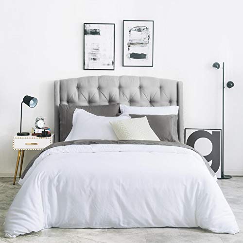
I chose the dusty rose upholstered beds because they instantly set the tone for the room. The plush tufted headboards add softness, texture, and a little drama, while still feeling sweet and age-appropriate. Since there are two beds, matching them keeps the room balanced and polished instead of busy.

I chose a soft rug to ground the two beds and make the room feel cozy. Since the beds and wallpaper already bring in a lot of pink, the rug keeps everything calm and airy. It also helps connect both beds into one finished layout.

The ribbed dresser was chosen because it adds texture while still keeping the room clean and elegant. I liked that it could work as both storage and a vanity area, making the room feel pretty but also practical. The soft white finish keeps the pink from becoming too heavy.

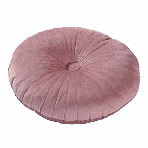
The blush velvet chair was chosen to tie the vanity area back to the beds. I wanted the corner to feel intentional, not like a random desk was placed there. The curved shape and soft upholstery make it feel feminine, cozy, and part of the overall design.

I chose a round mirror because the room already has so many soft, curved details; the headboards, the pillows, the lamps, and the rounded nightstand. The gold frame adds a warm touch and gives the dresser area a more finished, boutique-style feel.

The two globe lamps were chosen to frame the mirror and make the vanity feel symmetrical. Their round shape repeats the mirror and the round pillows on the beds, which helps the room feel cohesive. The soft glow also adds a cozy, elegant feeling, especially against the blush curtains.

The cream-and-gold ceiling fixture was chosen because it adds a polished, grown-up detail without feeling too formal. The hanging globe pendant between the beds gives the center of the room a custom designer touch and helps draw the eye to the back wall.


The layered curtains were chosen to soften the whole side of the room. The sheer white panels keep the room bright and airy, while the dusty rose drapes add richness and warmth. They also help balance the pink beds on the opposite side of the room.

The rounded white nightstand was chosen because it keeps the center of the room clean and modern. Since the two beds are already bold, I wanted the middle piece to feel simple and calm. The rounded shape also works beautifully with the rest of the soft curves in the space.


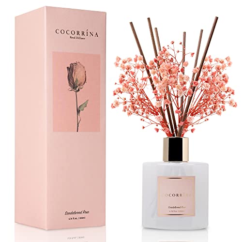
The pink floral diffuser was chosen for the bottom shelf because it adds a sweet finishing detail and a little height. The soft flowers bring in another natural element, while the small bottle keeps the look delicate and not cluttered.

I chose the mauve sculptural candles because they add texture and depth to the shelves. Their curved ribbed shape feels artistic and soft, and the mauve tone ties in beautifully with the beds and curtains. Keeping it to two candles makes the shelf feel cleaner and more elevated.

The wire flower was chosen because it adds a delicate sculptural detail without taking up too much visual space. It repeats the floral idea in a more modern way and brings in a little metallic shine to connect with the gold accents in the room.

I chose the “Relax” sign because it gives the room a soft, calming message while still fitting the floral theme. The blush flower detail connects back to the wallpaper and keeps the shelf styling gentle and feminine.